We wanted to make it BOLD
The need of the hour was to make the old-fashioned and traditional portal contemporary. The ethics with which they bring news to their readers be summarised in one word – BOLD’.
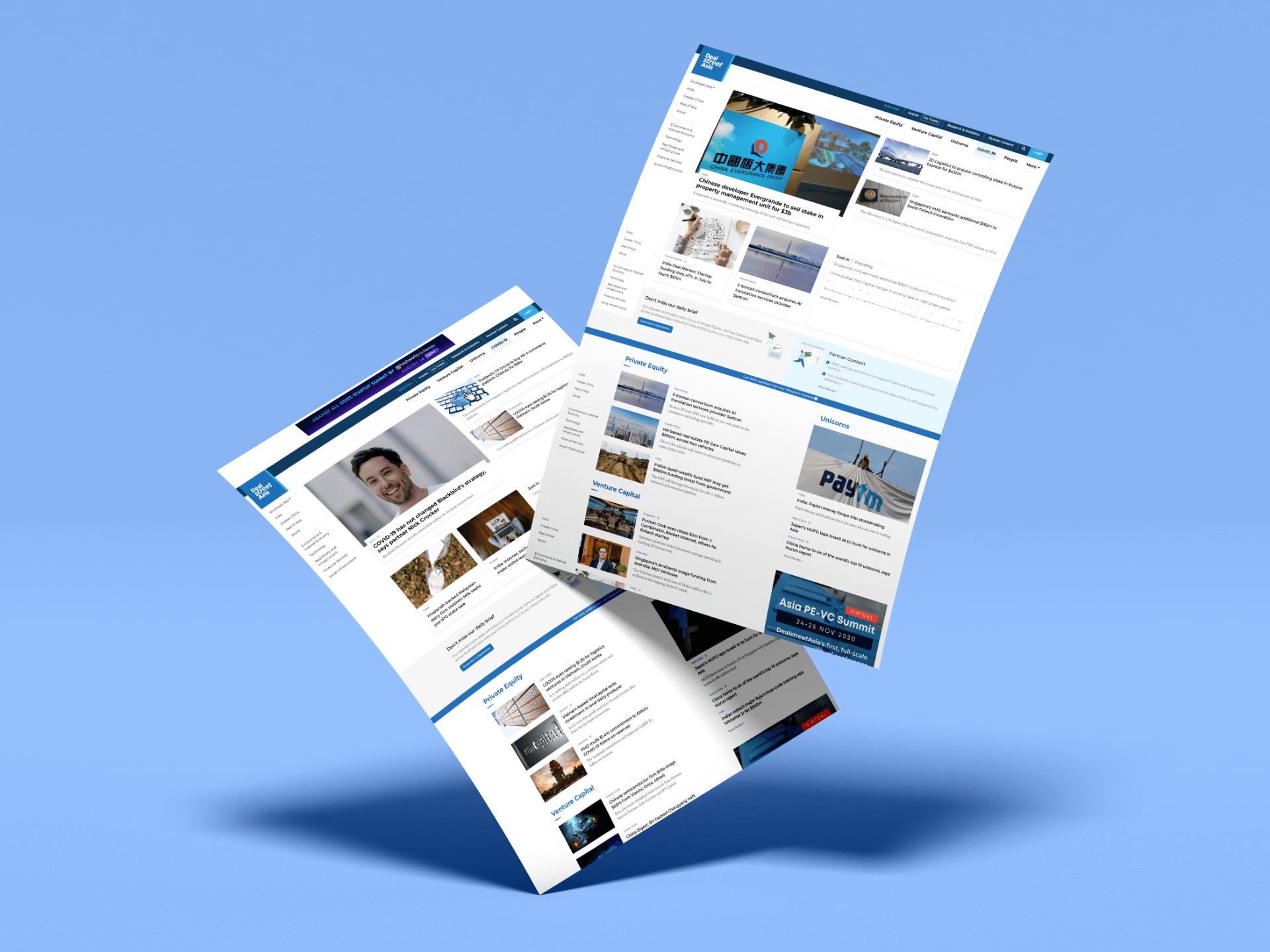
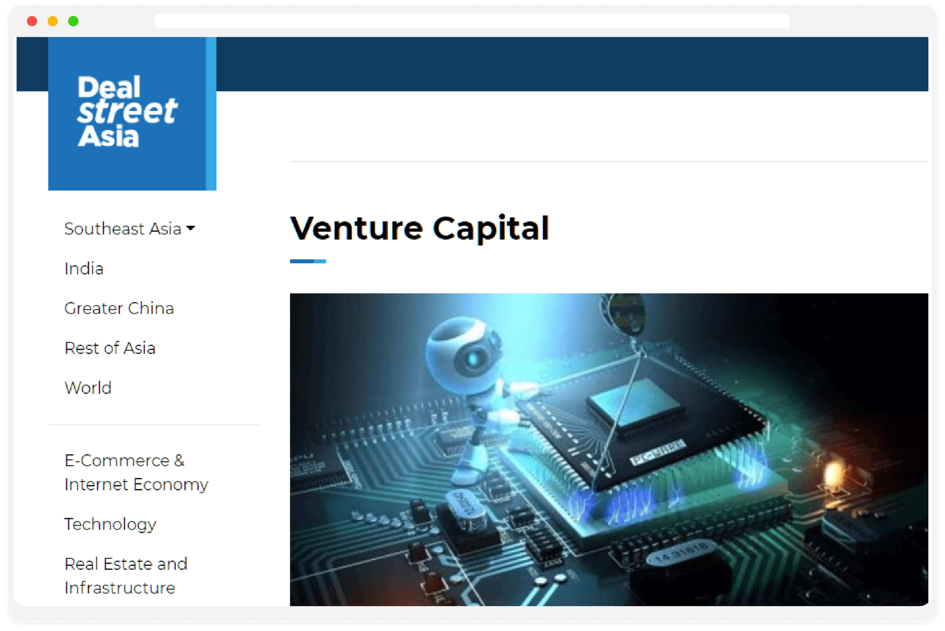
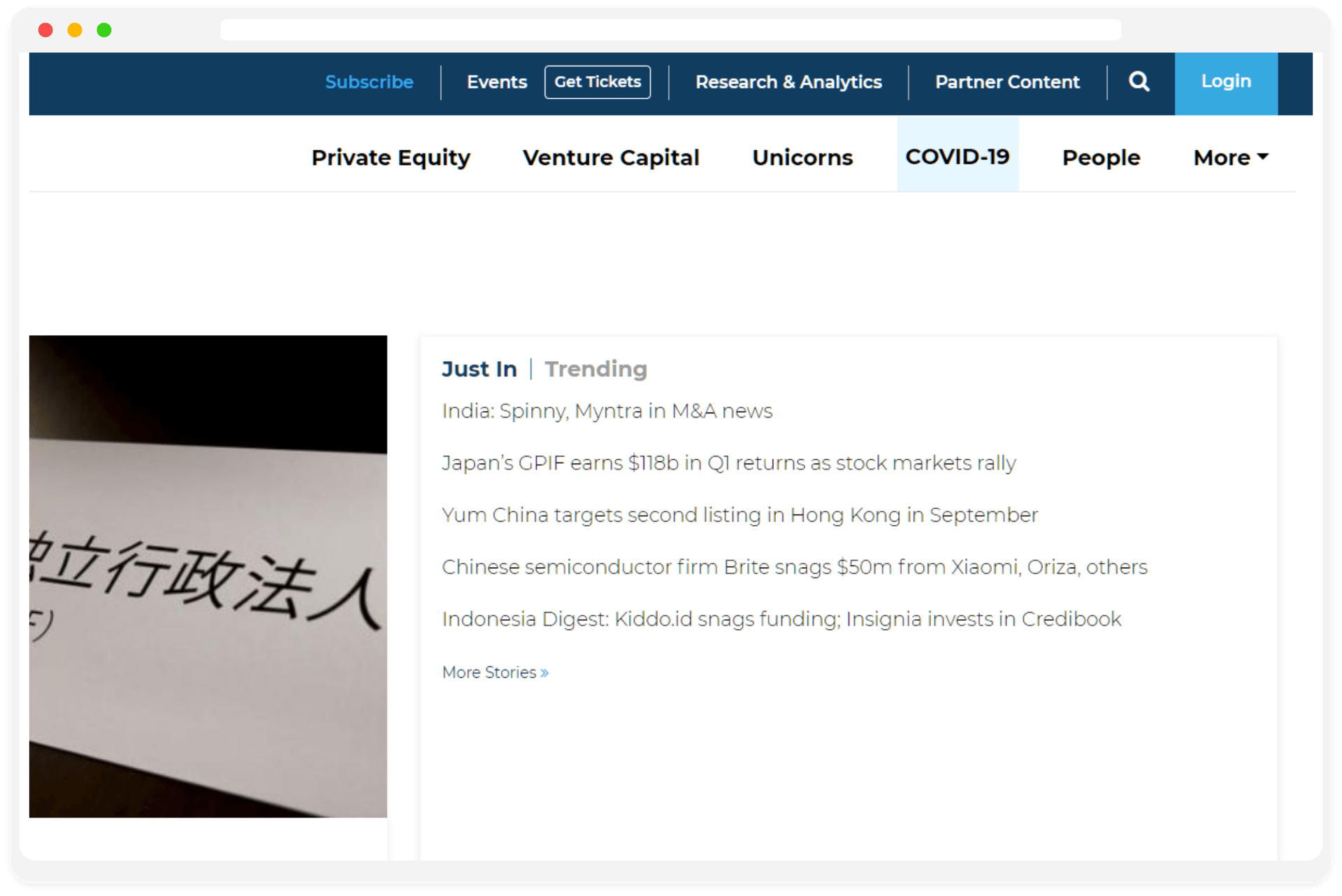
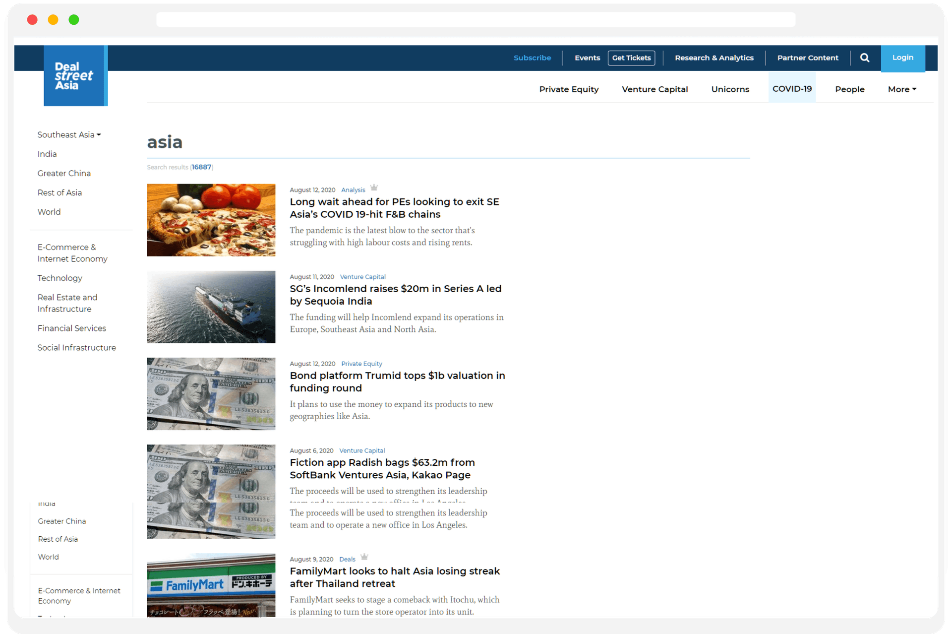
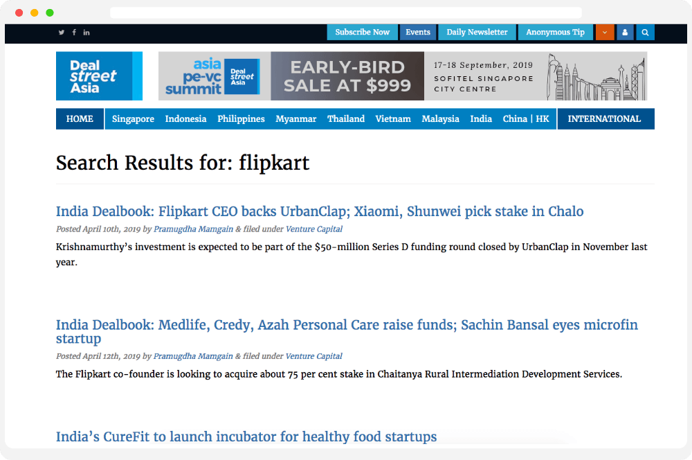
How it used to be
Main
landing page
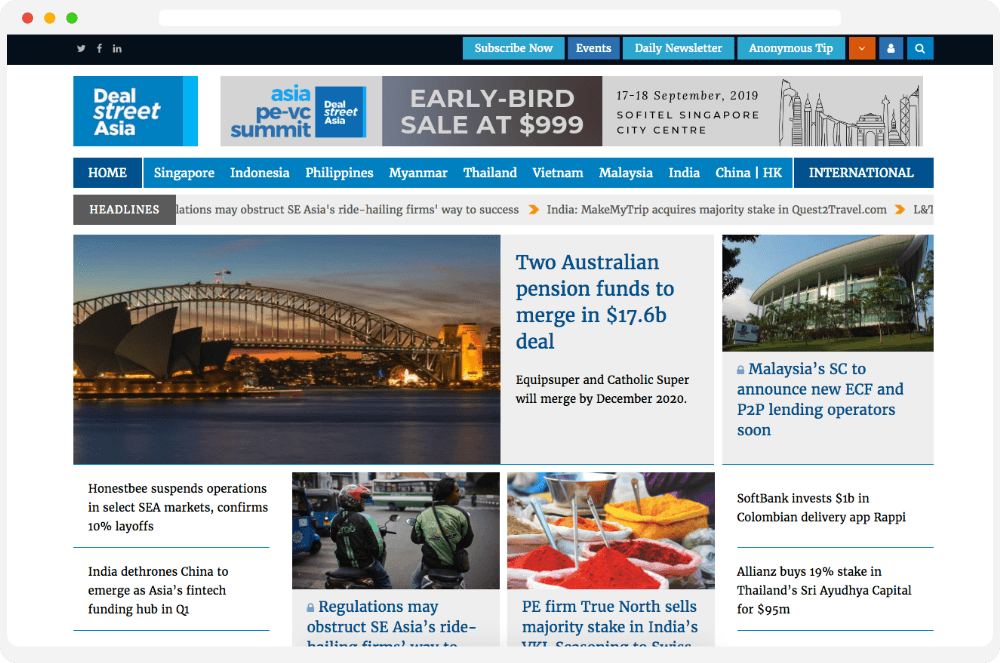
Story page
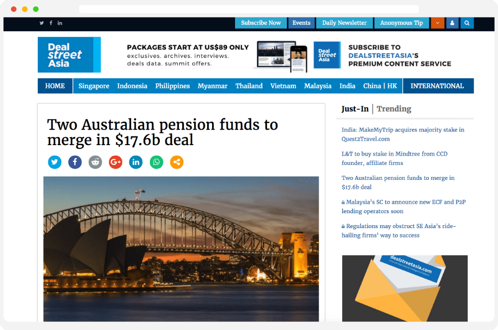
Search
result page
The new design is our answer to a WHY
The Branding & Digital Marketing team of DealStreetAsia helped us answer all our concerns and questions. The team had great clarity on what DSA is looking for from the redesigned portal. We decided to have a clear differentiation for the top stories and other stories according to their importance and context. We tried different combinations of fonts and finally selected Montserrat as main font and Mate as a secondary font based on our readability testing. We followed the brand colour Blue.
#0495CF
#44D2F7
#3D3D4A
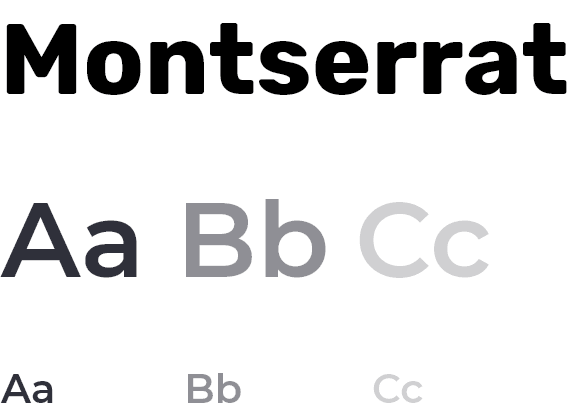
Mate

Wireframing our thoughts
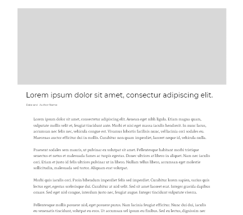
Story Page
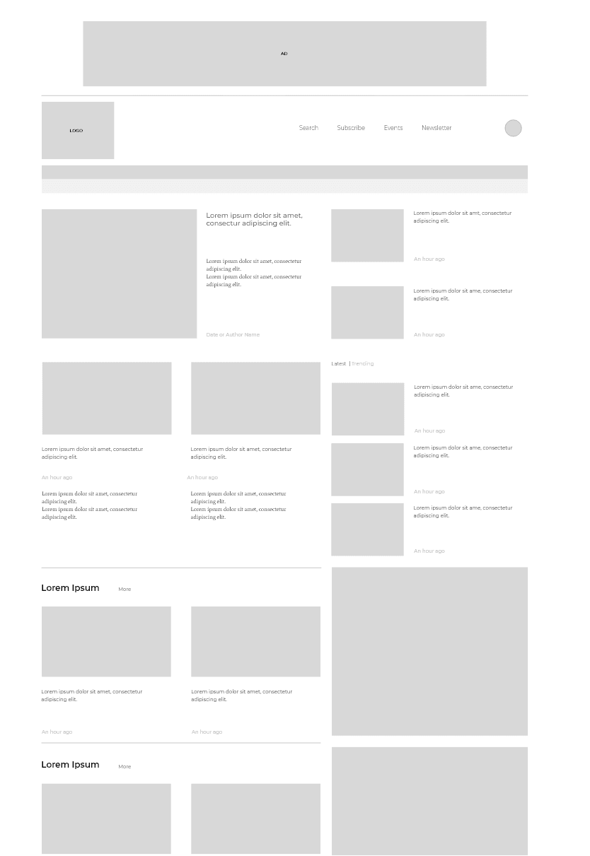
Landing Page
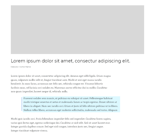
Story page (Blue BG highlights)
Catering to entrepreneurs world wide
Readers being the priority
The news grid
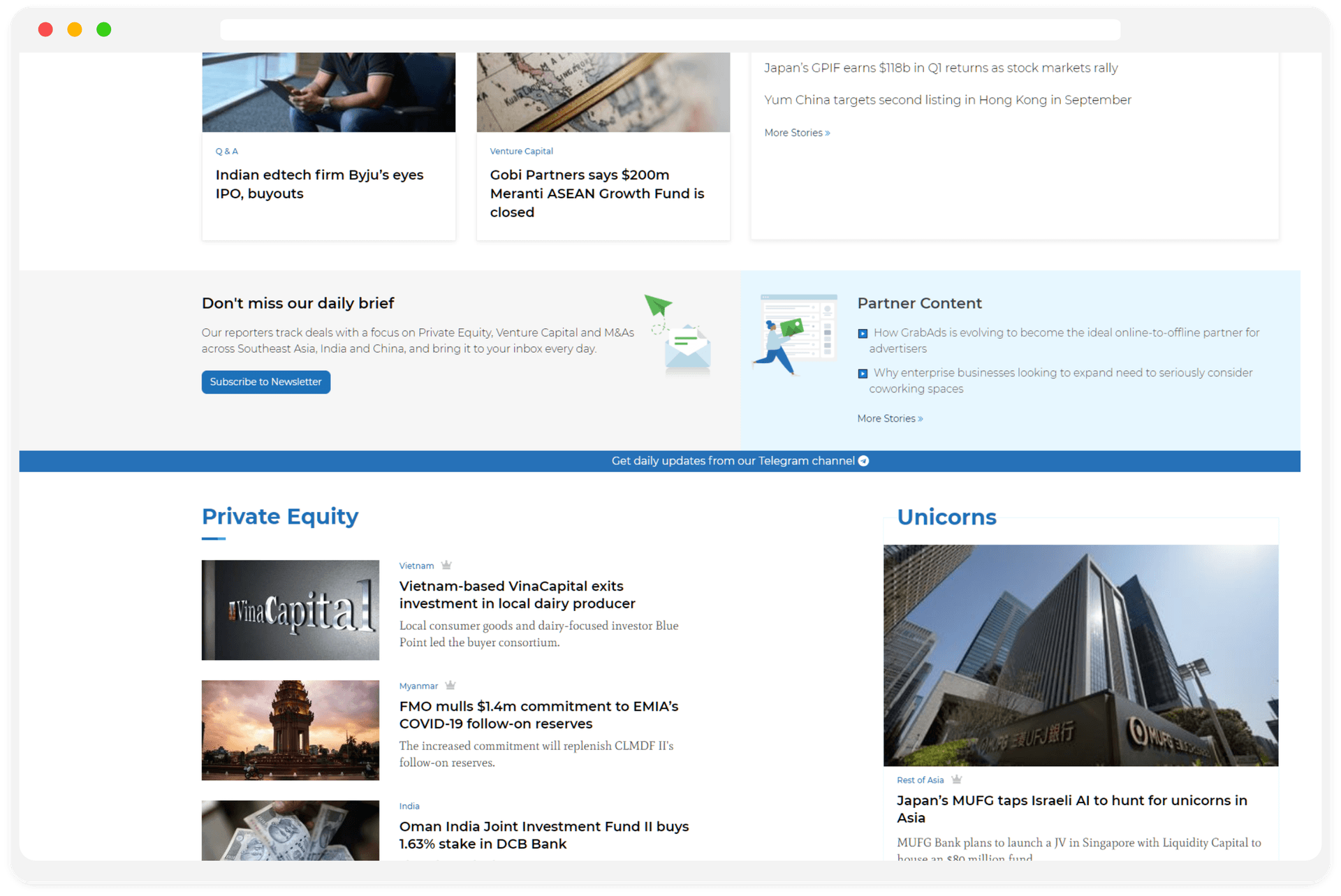
We tried to understand which news is more important to a business person and accordingly created categories which are easy to scroll and read through.
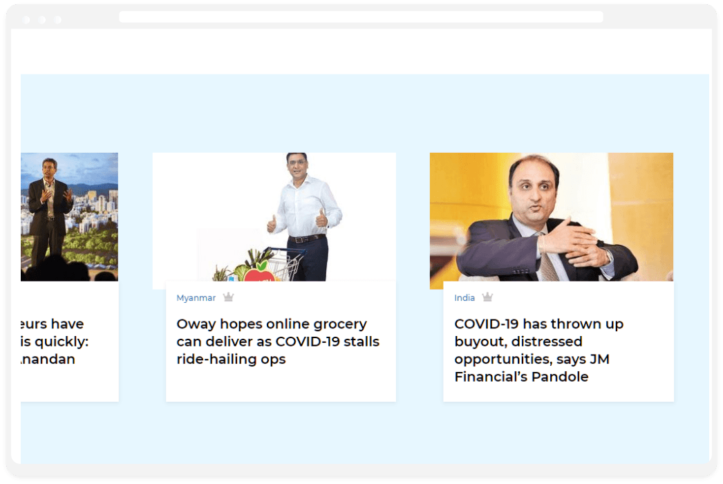
Now with better readability
We understood the main focus points that a business man has to see, Dividing into categories and making easy for a user to navigate around the news.
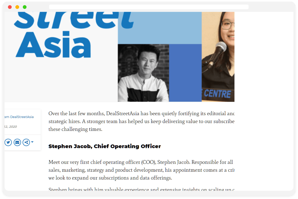
Customizations
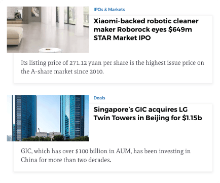
The first layout gives you a gist of news that you might be interested in. It displays the Image, Category, Headline and News.
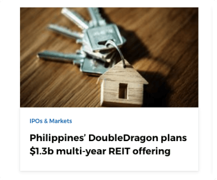
Another card layout displays more relevant news with the Image, Category and Headline.
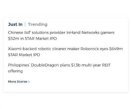
This custom layout shows the Headline of the trending news.
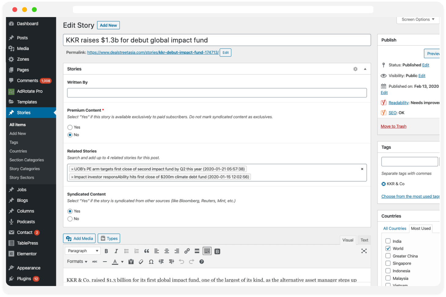
For the editors
The editing interface is built keeping the editors convenience. The tool is easy to use and highly interactive which gets the work done in no time
